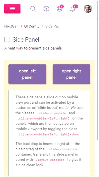
Side Panel A neat way to present side panels
This message is visible to IE users only!
This specific layout structure you are trying to view is buggy on Internet Explorer, which may cause the container to stretch. This is a bug within flexbox and IE, unfortunately there is no direct solution. The workaround would be to contain the box with .d-block and .position-absolute with defined width .w-100 and height .h-100. To see a working example of this, check out our Inbox page which uses the same layout structure with a bit of tweaking.
These side panels slide out on mobile view port and can be activated by a button as an "slide in/out" mode. We use the classes .slide-on-mobile and .slide-on-mobile-{left,right} on the panels, which are then activated on mobile viewport by toggling the class .slide-on-mobile-{left,right}-show
The backdrop is inserted right after the closing tag of the .slider-on-mobile container. Generally this slide panel is pared with .layout-composed to give it a nice clean look.